In this blog post, I will share with you how to set up the PMM QAN for MongoDB and the formulas behind the metrics and graphs that you see on the QAN dashboard.
When one of my customers wanted to load test and understand the behavior of the queries in their MongoDB instance through a monitoring tool, we used PMM. For query analysis, the PMM QAN dashboard helps you to optimize database performance by making sure that queries are executed as expected and within the shortest time possible. You can take a look at the demo of PMM QAN.
In this case, the customer wanted to understand how the graphs and metrics are calculated and the formulas behind the examples on the QAN dashboard page. So, I prepared a document which has the formulas for the metrics shown in the graphs.
The ideas apply to MongoDB and MySQL, as well as other database sources. I have used MongoDB as an example from my local machine to show the metrics calculated in QAN dashboard.
Perhaps your application uses a query running for long time but not frequently (like reports, data warehousing). Or maybe you have examples where you use short running queries frequently (like login tables, page visits). In these cases, understanding these graphs & metrics can help you to differentiate the values and plans, allowing you to tune your queries in the right way.
PMM – a brief introduction
As a traditional practice when writing a blog, let me also give you an introduction to the platform that we are going to talk about – PMM 🙂
The PMM platform is based on a client-server model to support scalability. It includes the following modules:
- PMM Server is the core of PMM that aggregates collected data and presents it in the form of tables, dashboards, and graphs in a web interface.
- PMM Client installed on every database host that you want to monitor. It collects server metrics, general system metrics, and Query Analytics data for a complete performance overview.
PMM is a collection of tools designed to seamlessly work together. Some are developed by Percona and some are third-party open-source tools.
The structure of the PMM is illustrated in the diagram below:

PMM QAN
Now we are into our main topic PMM QAN, a component available in PMM. The PMM QAN dashboard enables you to analyze MySQL/MongoDB/external query performance over a period of time and identify any issues. We can split PMM QAN into three components:
- QAN API – backend for storing and accessing query data collected by the QAN agent running on a PMM Client
- QAN App – web application for visualizing collected Query Analytics data
- QAN Agent – client side agent that collects the data from the database
Add QAN metrics
To see data in the PMM QAN dashboard, you need to add “queries” monitoring metrics as below to the PMM agent to collect the information. In MongoDB, the profiler should be enabled at instance level or database level.
1 | pmm-admin add mongodb:queries |
More details are given here for MongoDB and here for MySQL.
1 2 | root@e3df39a1fd25:/# pmm-admin add mongodb:queries OK, now monitoring MongoDB queries using URI localhost:27017 |
It is required for the correct operation of PMM QAN that profiling of monitored MongoDB databases be enabled. Note that profiling is not enabled by default because it may reduce the performance of your MongoDB server. For more information read the PMM documentation.
Here we are using a MongoDB server and enabling profiling at database level. You can enable the profiler in admin and local DBs also as shown below:
1 2 3 4 5 6 7 8 9 10 11 12 13 14 | my-mongo-set:PRIMARY> use admin switched to db admin my-mongo-set:PRIMARY> db.setProfilingLevel(1) { "was" : 2, "slowms" : 100, "ok" : 1 } my-mongo-set:PRIMARY> use local switched to db local my-mongo-set:PRIMARY> db.setProfilingLevel(1) { "was" : 1, "slowms" : 100, "ok" : 1 } my-mongo-set:PRIMARY> use vinodh switched to db vinodh my-mongo-set:PRIMARY> db.setProfilingLevel(1) { "was" : 1, "slowms" : 100, "ok" : 1 } |
Alternatively, you can enable the profiler at instance level by starting the instance with tjhe following option set in the conf file:
1 2 3 4 | operationProfiling: slowOpThresholdMs: 200 mode: slowOp rateLimit: 100 |
PMM QAN Summary Table
The QAN dashboard page from the PMM demo url looks like the screenshot below. This can be selected from the PMM home page by changing the Host value in the left top corner to select the host for which we need to see the metrics. Also, the duration of the metrics needed can be adjusted using the option available at the top right corner of the page – < zoom out > . There is a text box available below that for the Query filter, where we can type the query abstract or the query to filter from the available list of queries in the summary table. Filtering the query won’t change the values shown in the summary table, but the values are affected by the duration that you choose. In this example, the configuration shows a chosen duration of 48 hours, from Apr 24th 08:00:00 to Apr 26th 08:00:00.
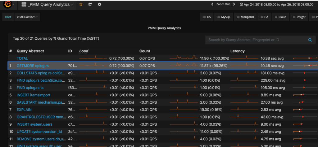
The summary table lists the top 10 queries ranked according to the Grand Total Time (%GTT) and we could select more queries if they are available by clicking on the message “Load next 10 queries”. In the graph above, 10 more queries can be listed by clicking on that, and the list continues in multiples of 10 until the last query for the selected duration is displayed.
These titles are the query attributes available in the summary table:
- TOTAL – totals of the load, count, and latency for all queries that were run on the selected database server during the time period selected
- # – rank of the query in the table
- Query Abstract – essential part of the fingerprint which informs the type of query, such as INSERT, or UPDATE, and the queried tables, or collections
- ID – unique hexadecimal number associated with the given query
- Load – the amount of time that the database server spent during the selected time or date range running all queries.
- Count – the average number of requests to the server during the specified time or date range
- Latency – the average amount of time that it took the database server to retrieve and return the data.
When we hover the cursor over the required metrics, the current value is displayed at the point where the cursor is located. This value will change as the cursor is moved along the line of the graph, displaying the data accordingly. The sections below explain the query attributes – Load, Count and Latency and their related metrics.
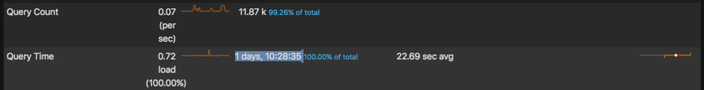
Load
This section shows us the amount of time that the database server spent running all queries during the selected time or date range.
In the graph above, the first query load avg was 0.72. For example, here the duration selected is “Last 2 days” – 24 hours. The below graph “Query Time” statistics explains this in detail for this query – “GETMORE oplog.rs” under query summary part below the summary table.

This could be calculated by the below formula:
1 2 3 4 5 6 | (Total duration of the query) / (Total duration of the graph) = (Avg. load) Total Time executed = 1 day, 10:28:35 = 124115 seconds Total duration we selected for the graph = 48 hours = 172800 124115/172800 = 0.72 |
Count
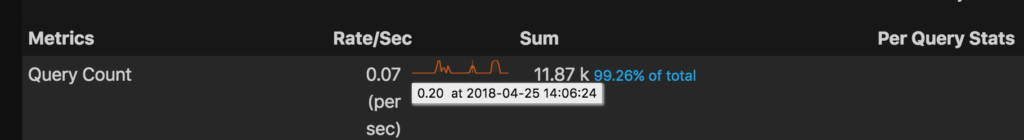
This section shows a count of the times the particular query got executed. From the graph below, we see that it has executed 11.87k times. The total number of counts of all commands are 11.96k for the selected period (the first line from the Summary Table displays the TOTAL).
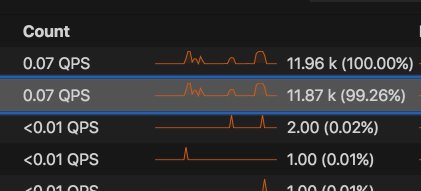
This metric is useful when you want to filter the queries based on the number of times they are executed in the database.
We can calculate the QPS (Queries per second) using the formula below :
1 2 3 4 5 6 | (Total no. of occurrence) / (Total duration of the graph) = (Avg occurrence of queries /sec) Total no. of occurrence = 11.87k = 11870 Total duration we selected for the graph = 48 hours = 172800 11870 / (24*2*60*60) = 0.07 |
Latency
This actually shows us the average amount of time that it took the database server to retrieve and return the data. The value 10.46 sec avg is calculated from the total occurrence and the total time it took to execute.
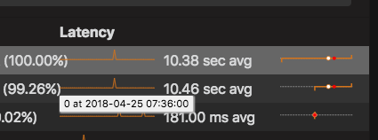
This is the graph you’ll want to look at most of the time as it tells how your query is performing. The lower the time, the better the performance. So this would give you some idea of how your query performs.
This value is calculated using this formula:
1 2 3 4 5 6 | (Total duration of the query) / (Total no. of occurrence) = (Avg time of query / occurrence) Total no. of occurrence = 11.87k = 11870 Total duration of the query = 1 day, 10:28:35 = 124115 seconds 124115sec/11870 = 10.46 sec avg |
Note:
● All the calculated values above were corrected to two decimal places
Using the graph
The most exciting feature in QAN is the EXPLAIN/JSON/INDEXES part of the query selected, as listed in the summary table. This can be seen in the bottom of the page after selecting the particular query that we need to check. For example, in this case, I chose to explore the first query and at the bottom of the page this can be seen:

By comparing the EXPLAIN plans before and after the index addition, query tuning or other action, we will be able to compare the performance changes and see the results of our work directly. You can read this blog post discussing about checking queries by my colleague Tate Mcdaniel
How can we actually use these metrics/graphs to identify a problem or potential for performance improvement?
The answer: by knowing the time of the issue and selecting the duration according to that. Then, we can first gather the metrics of the affected query and then by using the EXPLAIN/JSON/INDEXES metrics in the dashboard, tune our queries. By using pt-mysql-summary & pt-summary, we can collect the statistics to tune our DB / DB Server. Once modified, we then compare the results with the earlier records. This comparison actually helps you to see the performance difference.
Tips and Hints
- When you add monitoring services, i.e. mysql:queries or mongodb:queries, you can specify the remote host to be the same server as where you have the PMM client.
For MongoDB:
1 | pmm-admin add mongodb:queries --uri [mongodb://][user:pass@]host[:port][/database][?options] name-to-client |
For MySQL:
1 | pmm-admin add mysql:queries --user USER --password PASS --create-user --host host-name name-to-client |
Some useful references
https://www.percona.com/software/documentation
https://github.com/percona/qan-agent/tree/master/qan/analyzer/mongo
https://github.com/percona/qan-app/tree/master/src/app/mongo-query-details