Percona Monitoring and Management (PMM) is built upon the shoulder of giants like Prometheus and Grafana. And speaking of Grafana, one of the coolest features that come with it is the ability to customize the experience through 3rd party plugins.
Plugins are an easy way to enhance the ability to have specialized graphs. One case that we saw in Managed Services is the ability to have a throughput graph, that shows QPS vs Threads running. This is different in essence of the “default” graphs that show a metric against time (time being the X-axis) since what we wanted is to show queries per second not during a time (that graph already exists) but for specific values of threads.
One way to achieve that is by using a plugin called Plotly that render metrics using the plot.ly javascript framework, but specifically will let us make the graph we need. Let’s get hands-on!
Installing Grafana plugins
Performing this task is pretty straightforward thanks to the grafana-cli command, that comes available inside any PMM installation. The only thing needed is the name of the desired plugin, and knowing the command syntax which is:
1 | grafana-cli plugins install <plugin-name> |
My case is a PMM through docker, so the full command and response is as follow
1 2 3 4 5 6 7 8 9 10 | [root@app ~]# docker exec -t pmm-server bash -c "/usr/bin/grafana-cli plugins install natel-plotly-panel" installing natel-plotly-panel @ 0.0.6 from url: https://grafana.com/api/plugins/natel-plotly-panel/versions/0.0.6/download into: /var/lib/grafana/plugins � Installed natel-plotly-panel successfully Restart grafana after installing plugins . <service grafana-server restart> [root@app ~]# |
All right, the final step before the plugin is fully ready to be used is to restart the “grafana-server” service. In our case, restarting the docker container will make the trick, the command is:
1 | docker restart pmm-server |
And after the container is back, the plugin is available:

Now, the next step was to actually create the graph. Like I mentioned above, the need for the plugin was to have a “live” graph of the database throughput, measured as questions per second, per each thread, just like the graphs that one can find on any benchmark article out there, where the idea is to show the units of work on different concurrency scenarios.
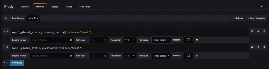
The metrics that we need are already being collected by PMM: mysql_global_status_threads_running (the “Threads running”) and mysql_global_stauts_questions (the “QPS”). Those are added on the regular “metrics” tab:
Then, we need the actual “Traces” for Plotly. Those are based on the metrics. We just need to assign the axis:

And then we have the desired graph. What is showing is the QPS per threads during the selected time range. That’s the reason why there are several points instead of one, like on regular benchmark graphs, because is not an accumulated value.

In this case, the graph shows that MySQL is mostly low concurrency traffic, with the majority of the threads around the value of 4, and some peaks at 6 threads, and QPS also low, having the peak at around 300 QPS.
Does it Work with PMM2?
You bet it does! Following the already described steps:
1 2 3 4 5 6 7 8 9 10 11 12 13 14 | [root@app ~]# docker ps CONTAINER ID IMAGE COMMAND CREATED STATUS PORTS NAMES 22bb13b5d6f9 percona/pmm-server:2 "/opt/entrypoint.sh" 3 hours ago Up About an hour 0.0.0.0:80->80/tcp, 0.0.0.0:443->443/tcp pmm-server [root@app ~]# docker exec -t pmm-server bash -c "/usr/bin/grafana-cli plugins install natel-plotly-panel" installing natel-plotly-panel @ 0.0.6 from: https://grafana.com/api/plugins/natel-plotly-panel/versions/0.0.6/download into: /var/lib/grafana/plugins � Installed natel-plotly-panel successfully Restart grafana after installing plugins . [root@app ~]# docker restart pmm-server pmm-server |
The plugin is available and we can make the same graph

In Conclusion
Enhancing the PMM experience through the Grafana plugins is a relatively easy task, in operational terms.
It is worth mentioning that the plugin and the dashboard will survive in-place upgrades of PMM. In-place means using the default PMM upgrade option available in the home dashboard:

This is key: Compatibility between plugins and Grafana versions is on you, Mr. User, and you only. If the PMM team updates Grafana to an incompatible version for any plugin you are using, it is on you only.