

I love graphs. They just make things easier when it comes to finding patterns. I also love visibility. Having the ability to known what is going on inside the database is priceless. How about having visibility of the slow queries execution time on a graph? Let’s do it.
We’ve already described how to get query digest using performance schema. Since the MySQL server is already doing the heavy lifting for you with little-to-no overhead, this information is available practically at will. So let’s make some graphs with that data.
To accomplish this I will use the well-known tool Graphite to store and render time-series data. For those who are not familiar with Graphite, it’s actually a 3-piece tool, consisting of:
- The Carbon metric processing daemons
- The Whisper time-series database library
- The Graphite-Web, a Django-based web application that renders graphs and dashboards
Instructions for installing it are out of the scope of this post, but it is not hard to find instructions surfing the web and it’s not more complicated than using yum/apt to do it.
One of the greatest things about Graphite is that feeding data to it can be quite simple. The most basic way to do it is by using the “plaintext protocol” which is nothing more than sending the data to a specific port with the proper format. The format is:
1 | <metric_path> <metric_value> <metric_timestamp> |
You can use netcat to send the information. That’s it.
I’ve decided to use an AWS MySQL RDS instance running sysbench for testing purposes. For the metric path format, I’ve used: mysql.rds.<query_formatted> <value> <timestamp>. Now, assuming that the carbon is in the localhost machine and knowing that the default port number is 2003, to send a value I just need to do something like:
1 | echo "mysql.rds.SELECT__ 0.00123 1445026691" | nc -w1 localhost 2003 |
And Graphite will take care of the rest!
The questions now are: Where do I get the data from? And how do I feed Graphite in a continuous way?
The first answer is: From the Performance Schema!
The second answer is: Bash.
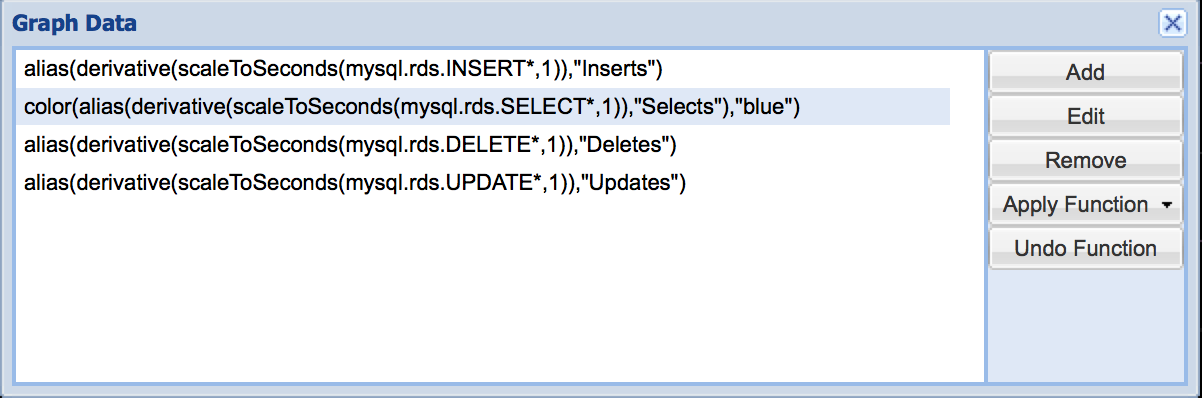
You can write a small script that takes care of consulting the performance_schema.events_statements_summary_by_digest table, gives a good format to the queries and sends the data to Graphite. This is the one I used for my testing:
1 2 3 4 5 6 7 8 9 10 11 12 13 14 15 16 | #!/bin/bash query="set session group_concat_max_len=2048; select concat(digest_text,'dash', round(sum_timer_wait/ 1000000000000, 6),'n') from performance_schema.events_statements_summary_by_digest order by sum_timer_wait desc limit 20;" IFS=" " for i in $(mysql -Nr -e"$query"); do digest=$(echo ${i%%dash*}) digest=${digest%%,*} digest=$(echo $digest | tr -d "`") digest=$(echo $digest | tr " " "_") digest=$(echo $digest | tr -d "?") digest=$(echo $digest | tr "." "-") digest=$(echo $digest | tr "(" "_") digest=$(echo $digest | tr ")" "_") value=$(echo ${i##*dash}) echo "mysql.rds.$digest $value $(date +%s)" | nc -w 1 localhost 2003 done |
Not too fancy, but it will do the trick. Calling the script inside an infinite loop at every 1 second for several hours, the result is:
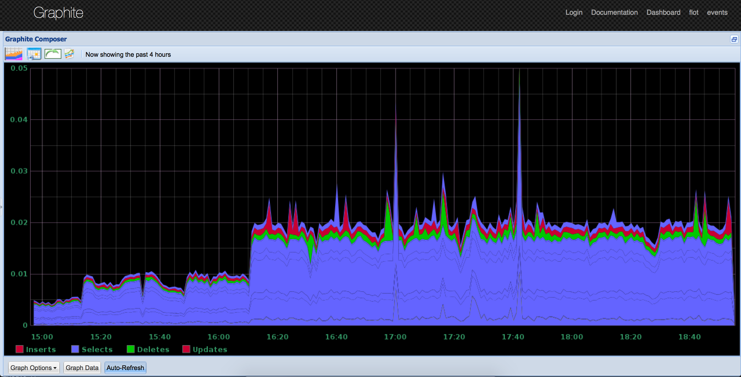 The above graph shows the delta between subsequent data points, previously normalized to 1 per second. The data points here are all the INSERT, SELECT, DELETE and UPDATE’s from the server, combined with wildcards, like this:
 In plain English: the graph shows how long the queries are taking. This will give you pretty good insight information from the queries’ perspective.
You can have more detailed graphs; for example, one with explicit queries that you want to track:
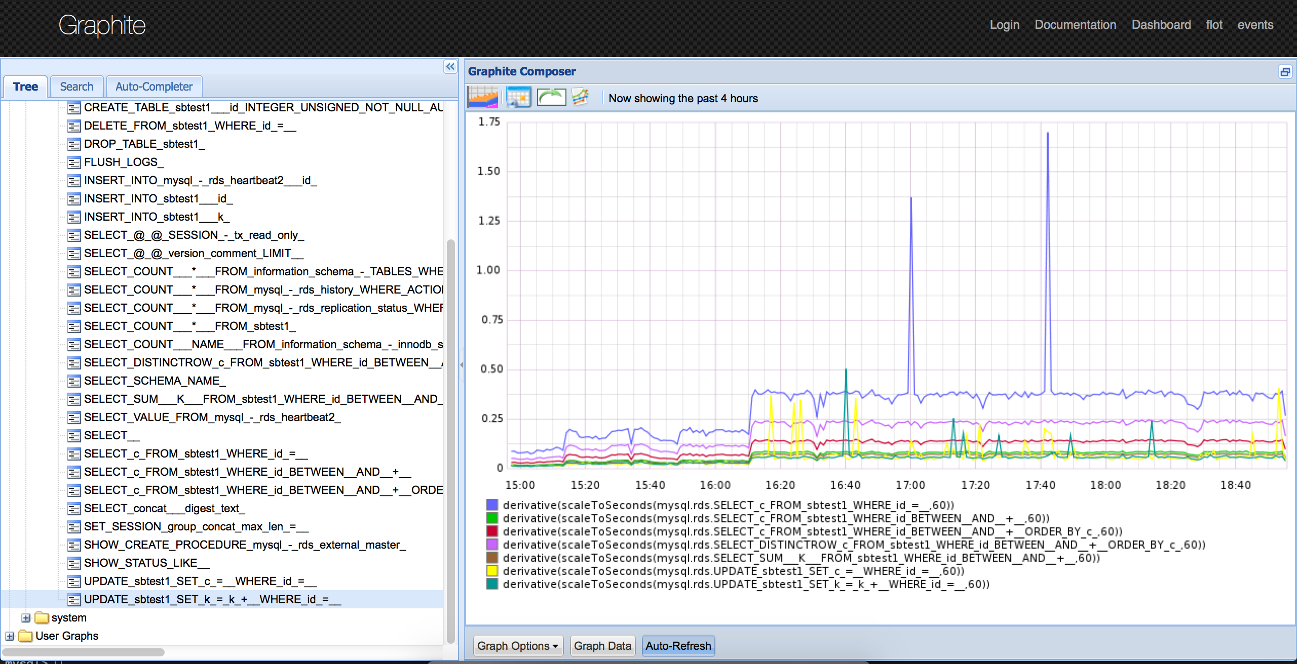 From the tree on the left you can see all the queries that the bash script has collected and sent to Graphite. This is somehow dynamic, since it will add “new” queries that fulfill the criteria.
This is just a small example of what can be done, but both Performance Schema and Graphite are very versatile and you can find creative ways to use them. Readers that are familiar with tools like Anemometer or the great blog post from openark might find this very similar; however this is a direct approach, that instead of using pt-query-digest with all it’s complexity, instead uses the P_S in a more customized and simpler way. Have fun!


Dani, Excellent post.
Is there any way to graph server usage using the SlowQueryLog as a source? I’ve been using it with global long_query_time=0 and pt-query-digest to optimize my App and I wonder if I could also use the log to view general mysql usage during a timeframe.
Thanks!
Martin: There is, it’s mentioned in the article: Anemometer. https://github.com/box/Anemometer/wiki