

In this blog post, we’ll look at how to create PMM custom graphs and dashboards to track what you need to see in your database.
Percona Monitoring and Management (PMM)‘s default set of graphs is pretty complete: it covers most of the stuff a DBA requires to fully visualize database servers. However, sometimes custom information is needed in graphical form. Otherwise, you just feel your PMM deployment is a missing a graph.
Recently, a customer request came in asking for a better understanding of a specific metric: table growth, or more specifically the daily table growth (in bytes) for the last 30 days.
The graph we came up with looks like this: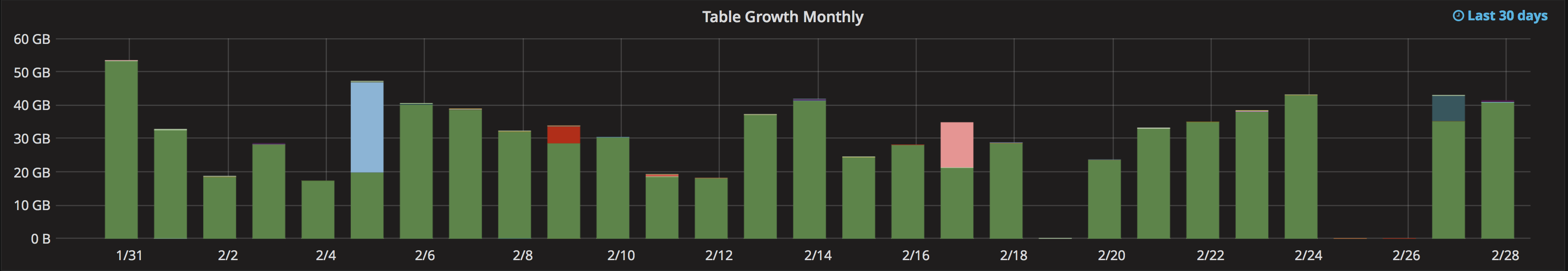
. . .which graphs the information that comes from this query:
1 | increase(mysql_info_schema_table_size{instance="$host",component="data_length"}[1d]) |
But what does that query mean, and how do I create one myself? I’m glad you asked! Let’s go deep into the technical details!
Before creating any graph, we must ensure that we have the data that will represent graphically. So, the first step is to ensure data collection.
Data collection
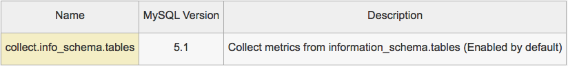
This data is already collected by the Percona mysqld_exporter, as defined in the “Collector Flags” table from the GitHub repo: https://github.com/percona/mysqld_exporter/#collector-flags
Cool! Now we need a Prometheus query in order to get the relevant data. Luckily, the Prometheus documentation is very helpful and we came up with a query in no time.
Prometheus query
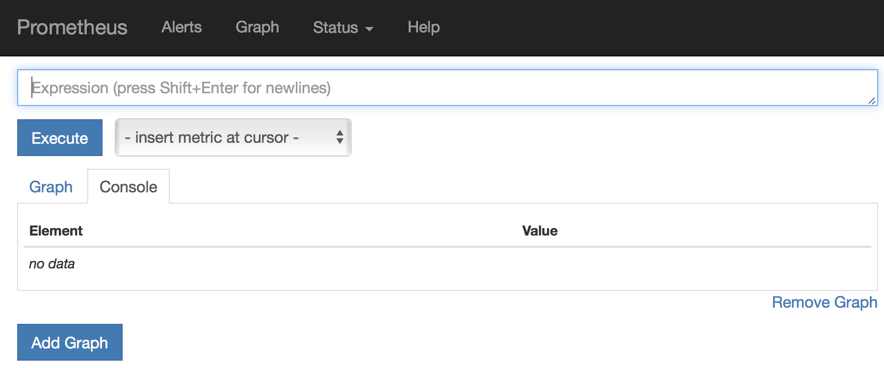
What do we need for the query? In this case, it is a metric, a label and a time range. Every PMM deployment has access to the Prometheus console by adding “/prometheus” to the URL. The console is incredibly helpful when playing with queries. The console looks like this:
The metric
The time series values collected by the exporter are stored in the metrics inside of Prometheus. For our case, the metric name is called mysql_info_schema_table_size, which I figured out by using the Prometheus console “Expression” text input and its autocomplete feature. This shows you the options available as you’re writing. All the metrics collected by mysqld_export start with “mysql”.
The label
Labels are different per metric, but they are intuitively named. We need the instance and component labels. Instance is the hostname and component is equivalent to the column name of a MySQL table. The component we need is “data_length”.
The time frame
This is easy: since is a daily value, the time frame is 1d.
The time frame is not mandatory, but it is a parameter asked for by the function we’re going to use to calculate the increase, which is called increase().
That’s how we ended up with the query that feeds the metrics, which end up in here:
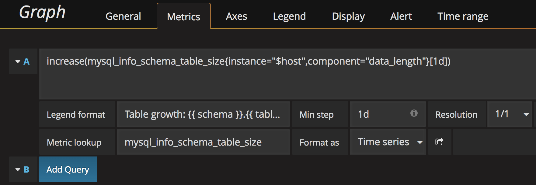
You will notice it’s using a variable: $host. We define that variable in the dashboard creation, explained below.
PMM dashboard
PMM best practice is to take a copy of the existing dashboard using Setting > Save as…, since edits to Percona-provided dashboards are not preserved during upgrades. In this example, we will start with an empty dashboard.
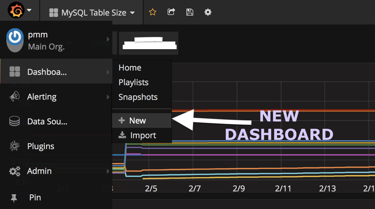
Adding a new dashboard is as easy as clicking the “New” button from the Grafana dropdown menu:
After that, you choose the type of element that you want on a new row, which is a Graph in this case:

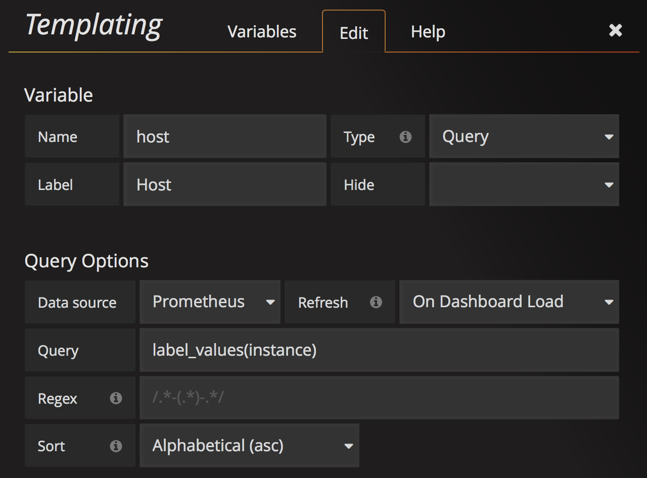
We like to use variables for our graphs – changing which server we analyze, for example. To add variables to the dashboard, we need to head up to the Templating option and add the variables:
Make sure you put a meaningful name for your dashboard, and you’re all set! A good practice will be to export the JSON definition of your dashboard as a backup for future recovery, or to just share it with others.
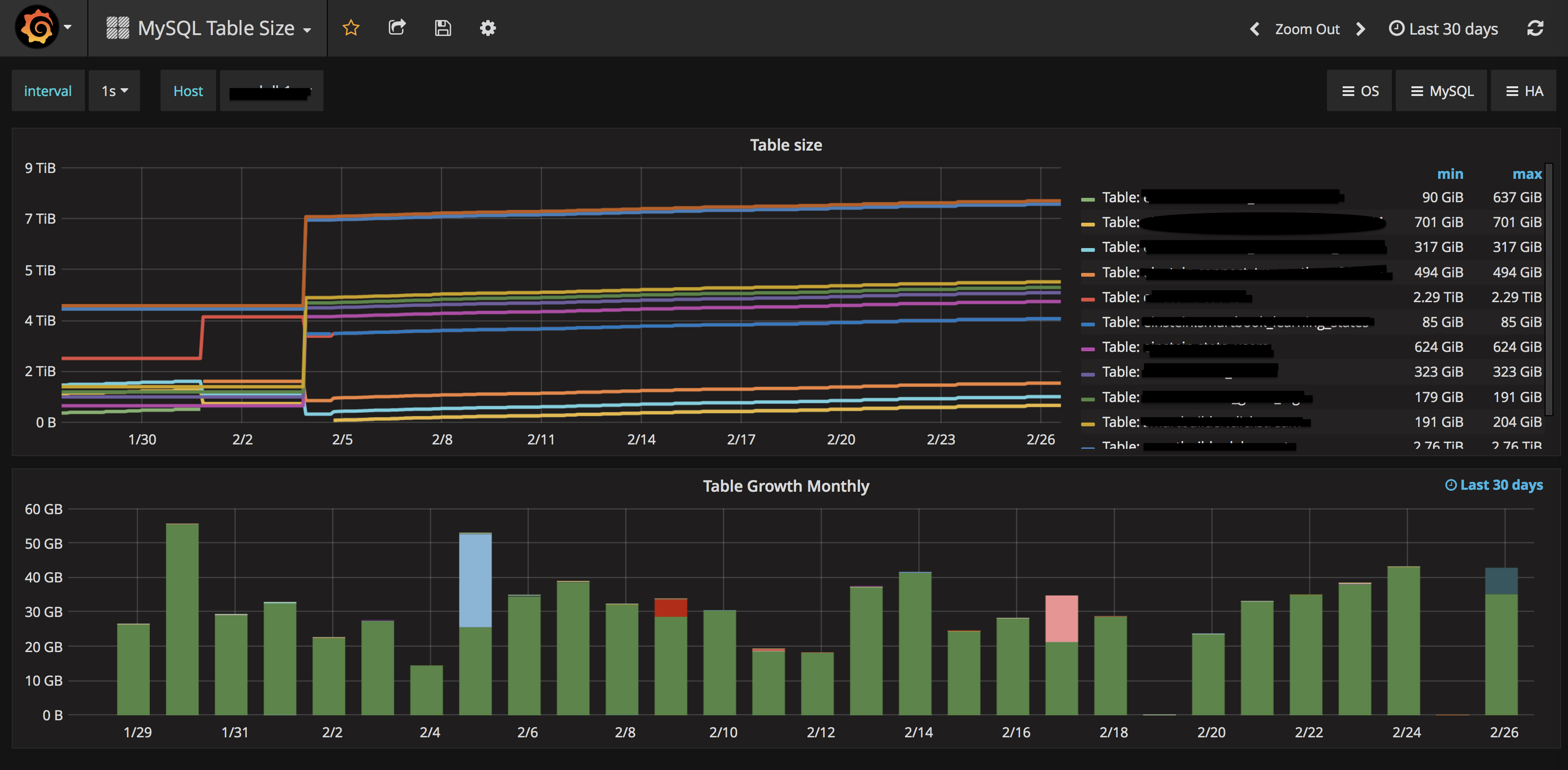
The final dashboard is called “MySQL Table Size” and holds another graph showing the table size during the timeframe for the top ten biggest tables. It looks like this:
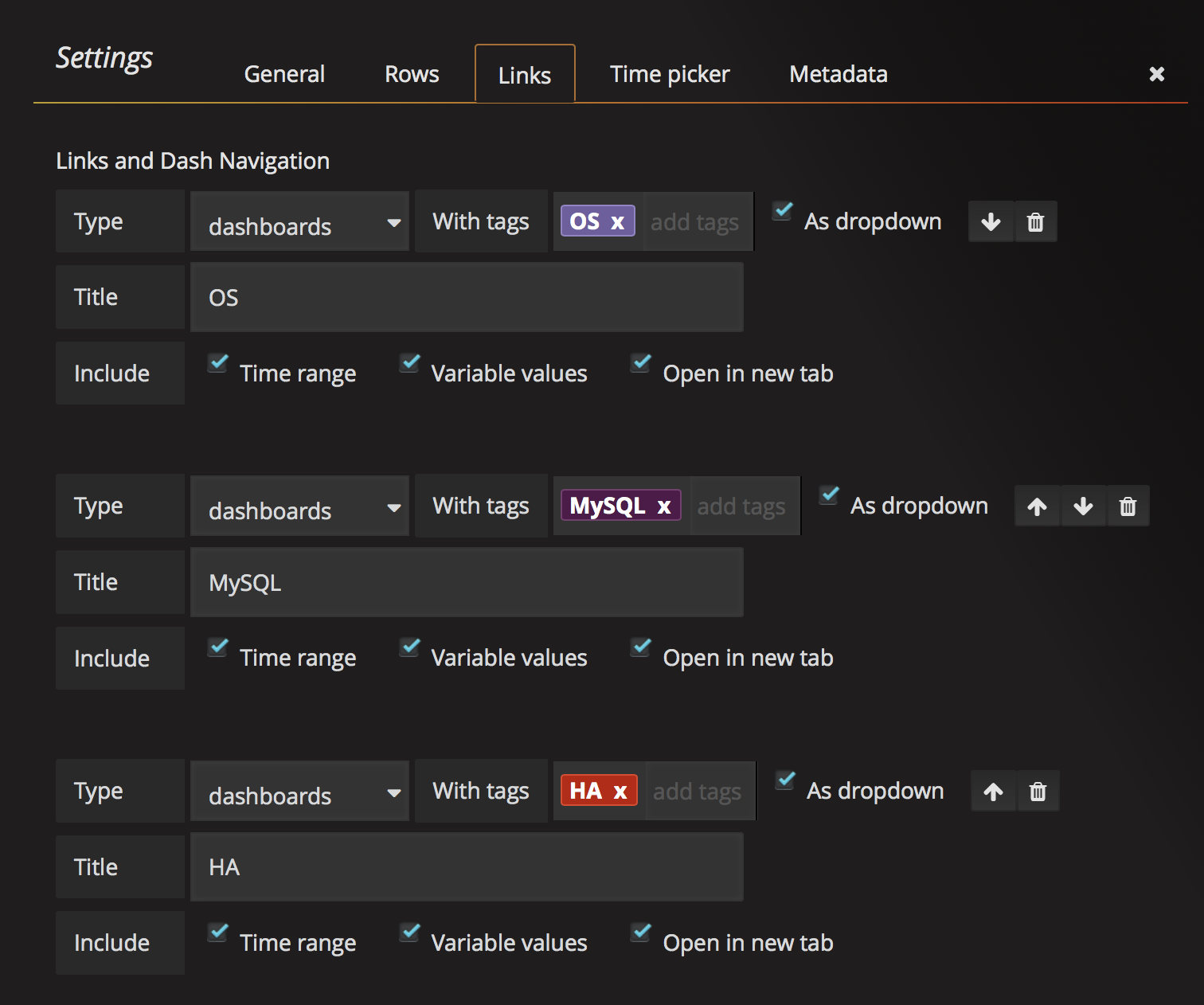
The top right of the screen has some drop down links, the ones that look like this:

You can add links on the “Link” tab of the dashboard settings:
In case you are wondering, the query for the “Table size” graph is:
1 | topk(10,sort_desc(sum(mysql_info_schema_table_size{instance="$host",component=~".*length"}) by (schema, table))) |
So next time you want to enhance PMM and you know that there is data already inside Prometheus, but PMM lacks the visualization you want, just add it! Create a new graph and put it to your own custom dashboard!


Hi, is there any chance of getting the json definition of that chart?
I tried to follow your instructions but all I get from it is “no data”, even in the Prometheus console.