

One of the new graphs added to Percona Monitoring and Management (PMM) is saturation metrics. This blog post explains how to use the information provided by these graphs.
You might have heard about Brendan Gregg’s USE Method (Utilization-Saturation-Errors) as a way to analyze the performance of any system. Our goal in PMM is to support this method fully over time, and these graphs take us one step forward.
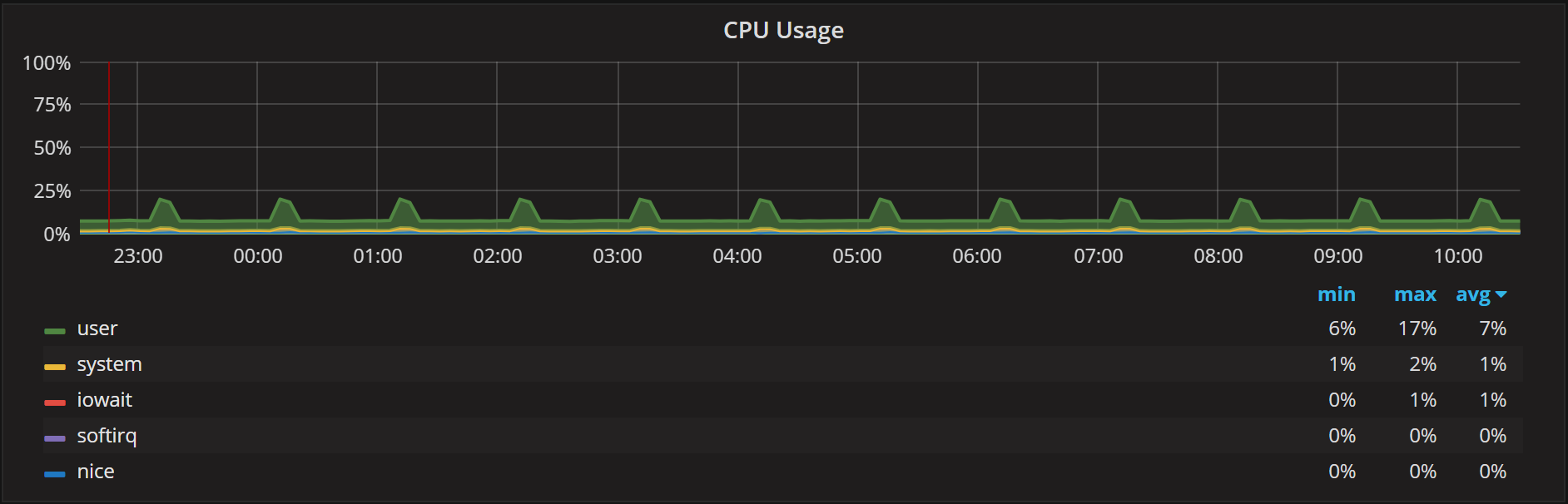
When it comes to utilization, there are many graphs available in PMM. There is the CPU Usage graph:
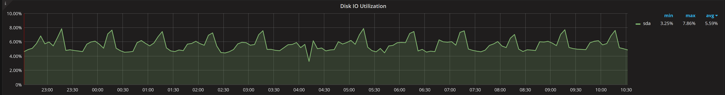
There is also Disk IO Utilization:
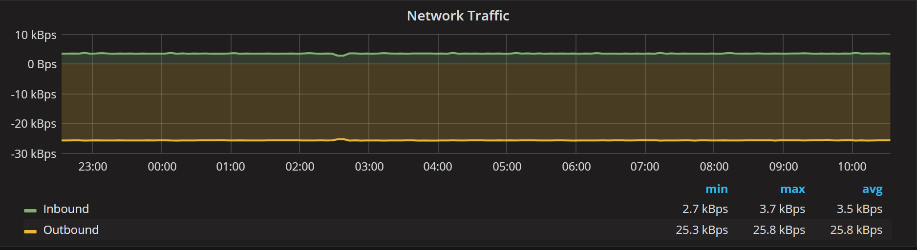
And there is Network Traffic:
If you would like to look at saturation type metrics, there is classical the Load Average graph:
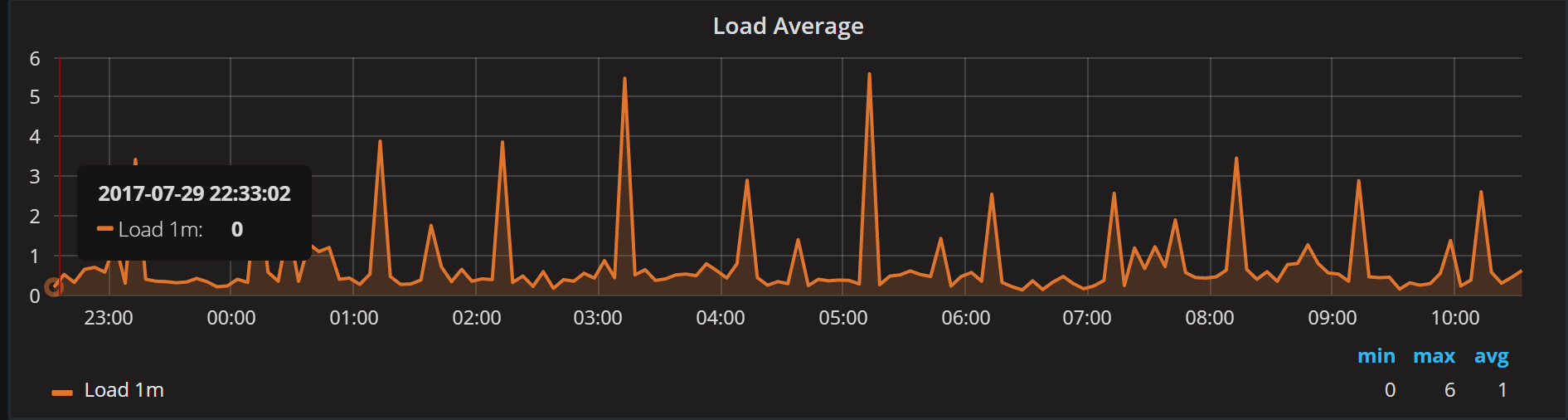
While Load Average is helpful for understanding system saturation in general, it does not really distinguish whether it is the CPU or Disk that is saturated. Load Average, as the name says, is already averaged — so we can’t really observe short saturation spikes with Load Average. It is averaged for at least one minute. Finally, the problem with Load Average is it does not keep the number of CPU cores/threads into account. Suppose I have a CPU-bound Load Average of 16, for example. That is quite a load and will cause high saturation and queueing if you have two CPU threads. But if you have 64 threads, then 16 becomes a trivial load with no saturation at all.
Let’s take a look at the Saturation Metrics graph:
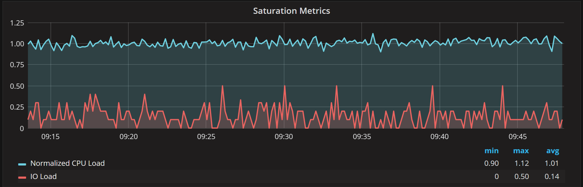
It provides us two metrics: one showing the CPU load and another is showing the IO load.These values roughly correspond to the “r” and “b” columns in VMSTAT output:
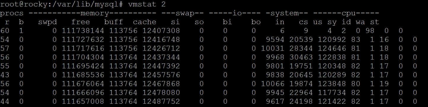
These are sampled every second and then averaged over the reporting interval.
We also normalize the CPU load by dividing the raw number of runnable processes by a number of threads available. “Rocky” has 56 threads, which is why the normalized CPU load is about one even though the number of runnable processes shown by VMSTAT is around 50.
We do not normalize the IO load, as systems can have multiple IO devices and a number of requests they can handle in parallel is largely unknown. If you want to understand specific IO device performance, you should check out the Disk Performance Dashboard.
Testing Saturation Metrics in Practice
Let’s see if saturation graphs indeed show us when CPU saturation is the issue. I will use a sysbench CPU test for illustration, run as:
1 | sysbench cpu --cpu-max-prime=100000 --threads=1 --time=60 run |
This will use the said number of threads to execute compute jobs, each of which will compute the said number of prime numbers. If we have enough CPU resources available, with no saturation, the latency of executing such requests should be about the same. When we overload the system, so there are not enough CPU execution units to process everything in the parallel, the average latency should increase.
1 2 3 4 5 6 7 8 9 10 11 12 13 14 15 16 17 18 19 | root@ts140i:/mnt/data# sysbench cpu --cpu-max-prime=100000 --threads=1 --time=300 run sysbench 1.0.7 (using bundled LuaJIT 2.1.0-beta2) Running the test with following options: Number of threads: 1 Initializing random number generator from current time Prime numbers limit: 100000 Initializing worker threads... Threads started! General statistics: total time: 300.0234s total number of events: 12784 Latency (ms): min: 23.39 avg: 23.47 max: 28.07 95th percentile: 23.52 sum: 300018.06 |
As we can see with one thread working, the average time it takes to handle a single request is 23ms. Obviously, there is no saturation happening in this case:
“Ts140i” has four CPU cores, and as you can see the Normalized CPU load stays below one. You may wonder why isn’t it closer to 0.25 in this case, with one active thread and four cores available? The reason is at exactly the time when the metrics are being captured, there often happen to be an additional two to three threads active to facilitate the process. They are only active for a very few milliseconds at the time, so they do not produce much load — but they tend to skew the number a little bit.
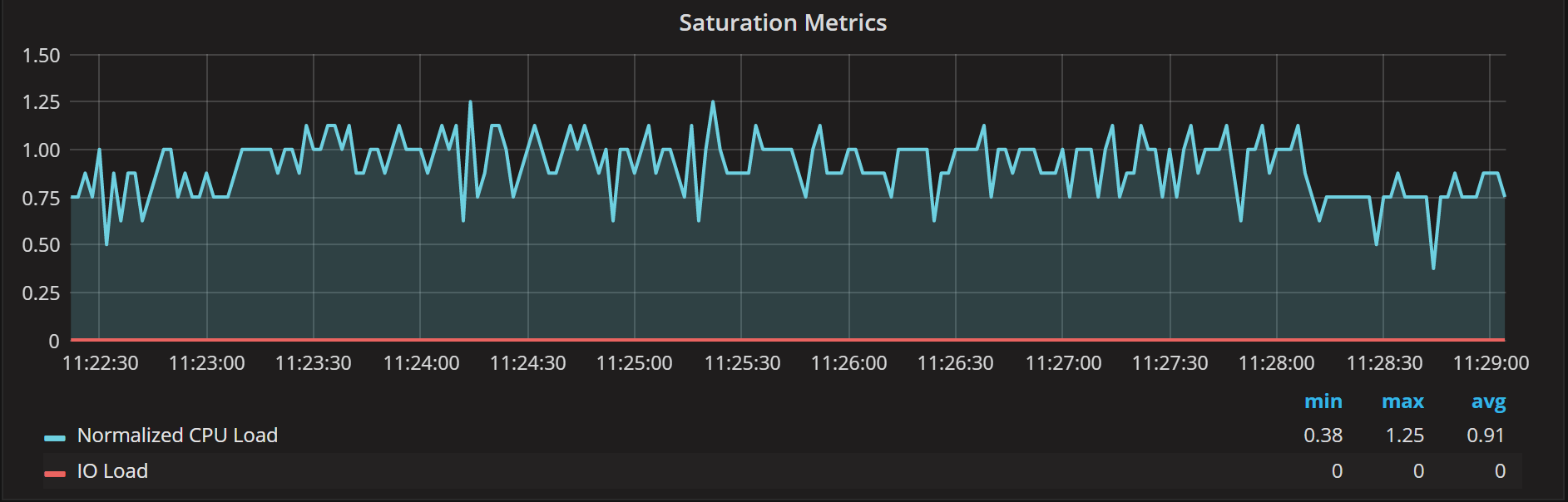
Let’s now run with four threads. The number of threads matches the number of CPU cores available (and it is true cores in this case, no hyperthreading). In this case, don’t expect too much increase in the event processing time.
1 2 3 4 5 6 7 8 9 10 11 12 13 14 15 16 17 18 19 20 21 | root@ts140i:/mnt/data# sysbench cpu --cpu-max-prime=100000 --threads=4 --time=300 run sysbench 1.0.7 (using bundled LuaJIT 2.1.0-beta2) Running the test with following options: Number of threads: 4 Initializing random number generator from current time Prime numbers limit: 100000 Initializing worker threads... Threads started! General statistics: total time: 300.0215s total number of events: 48285 Latency (ms): min: 24.19 avg: 24.85 max: 43.61 95th percentile: 24.83 sum: 1200033.93 |
As you see test confirms the theory – we have avg latency increased just by about 6% with Normalized CPU load in saturation metrics mostly hovering between 1 and 2:
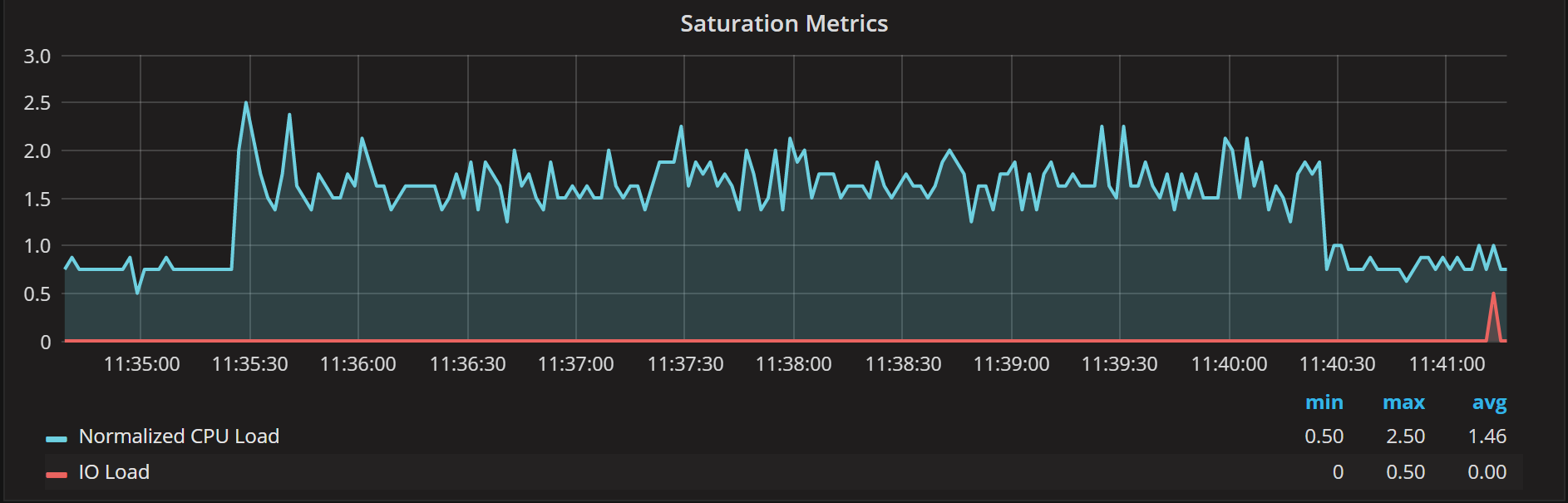
Let’s now do the test with 16 threads, which is four times more than available CPU cores. We should see the latency dramatically increase due to CPU overload (or saturation). The same will happen to your CPU bound MySQL queries if you have more concurrency than CPUs available.
1 2 3 4 5 6 7 8 9 10 11 12 13 14 15 16 17 18 19 20 21 22 23 | root@ts140i:/mnt/data# sysbench cpu --cpu-max-prime=100000 --threads=16 --time=300 run sysbench 1.0.7 (using bundled LuaJIT 2.1.0-beta2) Running the test with following options: Number of threads: 16 Initializing random number generator from current time Prime numbers limit: 100000 Initializing worker threads... Threads started! General statistics: total time: 300.0570s total number of events: 48269 Latency (ms): min: 27.83 avg: 99.44 max: 189.05 95th percentile: 121.08 sum: 4799856.52 |
We can see it takes about four times longer to process each request due to CPU overload and queueing. Let’s see what saturation metrics tell us:
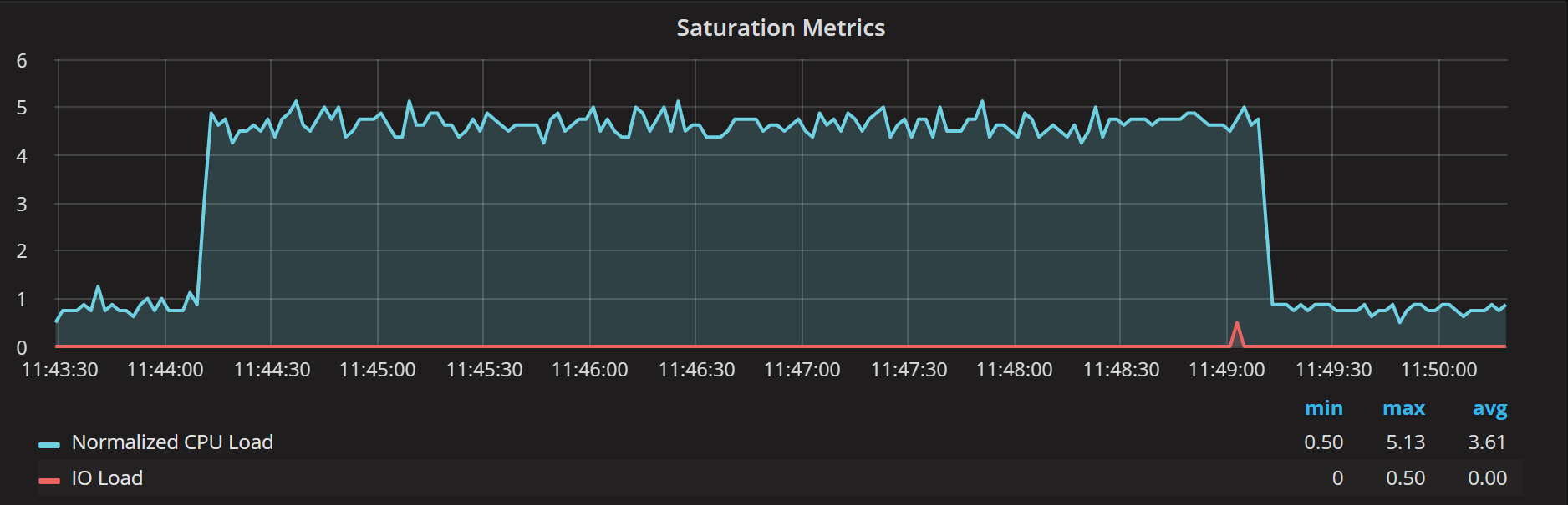
As you can see, Normalized CPU Load floats between four and five on the graph, consistent with saturation we’re observing.
You may ask does the CPU utilization graph help us here? Not really. You will see 100% CPU usage for both the run with four threads and 16 threads, while request latencies are completely different.
Summary
As we can see from our test, Normalized CPU Load is very helpful for understanding when the CPU is overloaded. An overloaded CPU causes response times to increase and performance to degrade. Furthermore, you can use it to (roughly) see how serious the overload is. As a rule of thumb, if you see Normalized CPU saturation over two, it indicates your CPUs are overloaded.


It sure would be nice if the System Overview dashboard could also monitor ProxySQL.
Erin,
Now there is a separate dashboard available for ProxySQL. I’m hoping Grafana will support the dynamic rows or dynamic panels in the future which would allow us to have Summary panel which provides summary on the all components which are running on the host